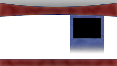
 First the basic elements of the studio in Photoshop: the top and bottom borders, as well as the inset picture placeholder for the story picture. These were just basic geometric shapes with gradient and pattern overlays, and strokes.
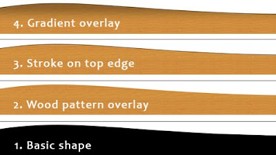
Next was Glinda's desk. Again, another basic shape (1), this time with a wood pattern overlay (2). The stroke on the top (3) emphasized the edge of the desk, and the gradient overlay (4) provided the lighting effect.
The background was a composite of two photographs of Spokane's Riverfront park, kindly provided by Shanti Perez. Adding the text for Glinda McGravy and the inset completed the static elements.
Next, it was over to After Effects to add Glinda's animation. Since she didn't move much, this was a simple masking and keying step.
However, just dropping her into the scene made her hands appear behind the desk. To overcome that, I duplicated the animation, placed it above the desk layer, and then masked out everything except her hands. This was a frame by frame procedure so it was fairly time consuming.
Glinda's minifigure was pretty boring. I didn't have time to physically customize it, so I opted to CGI her jacket and shirt. I used a picture of Katie Couric for inspiration because, let's face it, you can't get much better than that. Using CGI instead of a physical customized Lego torso meant that I had to motion track the shirt and jacket image to Glinda's movement. Luckily, the movement was minimal. I certainly won't try that for an action sequence.
To make the composition even more convincing, I added shadows for Glinda's hands on the desk. I created a solid black layer and then copied the masks I'd use to get the hands to appear in front of the desk. I finished them off by offsetting them down and to the right, adding a Fast Blur, and reducing the opacity.
That completed Glinda's comp, but I still had to get her onto the TV screen.
A simple Corner Pin effect took care of that, but it was missing something. It looked too flat.


No comments:
Post a Comment